Chromatic Mastery: The Definitive Men’s Luxury Color Guide

In the high-stakes arena of luxury menswear, color is your most potent silent communicator. While a bespoke fit is the price of entry, a sophisticated command of the palette separates the well-dressed from the truly influential. This guide decodes the science of sartorial color to ensure your presence is as intentional as your tailor’s stitch.
I. The Psychology of Power: Sartorial Semantics
High-end dressing isn't about following trends; it's about leveraging color psychology to project authority or approachability. In the upper echelons of business and society, your palette speaks before you do.
 The Sovereign Blues: The global standard for reliability and intelligence.
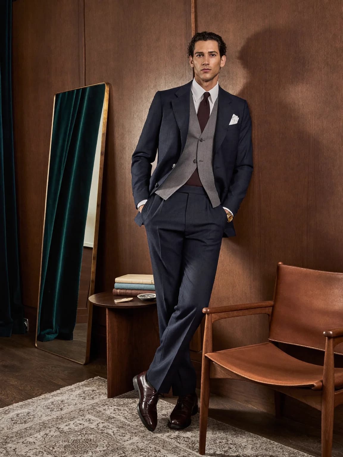
- The Sovereign Blues (Navy & Midnight): The global standard for reliability and intelligence. It remains the essential choice for the Modern Executive Wardrobe. A midnight blue suit in a high-twist wool projects a level of gravity that black simply cannot match.
- The Stoic Palette (Charcoal & Slate): Greys signal a composed, analytical mind. In luxury, the "Grey Eminence" look conveys a person who holds the power but doesn't need to brandish it. It is the color of the negotiator.
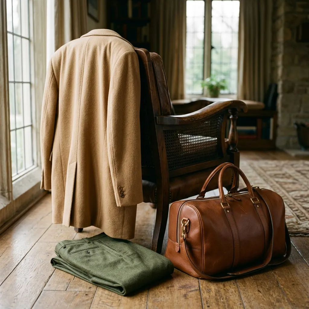
- Stealth Wealth Earth Tones (Camel, Olive, Tobacco): These shades project a grounded, organic sophistication. They are the hallmark of "Old Money" style—relaxed yet undeniably premium. They suggest a man who is as comfortable in a country estate as he is in a boardroom.
- The Aggressive Accents (Burgundy & Forest Green): Use these to signify energy and creative dominance without the abrasive quality of bright reds or neon shades. They are the "intellectual" alternatives to power colors.
II. Strategic Pairing: The Architecture of an Outfit
Luxury is defined by balance. The most expensive garment can be rendered pedestrian by a clashing palette.
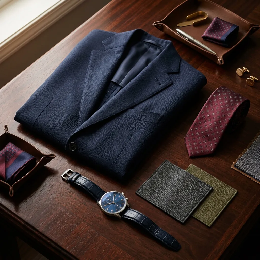
- The 60/30/10 Ratio: A professional standard for harmonious composition. Use 60% for your neutral base (the suit or overcoat), 30% for the secondary layer (shirt or knitwear), and 10% for the accent (pocket square, tie, or even the subtle clocking on your socks).
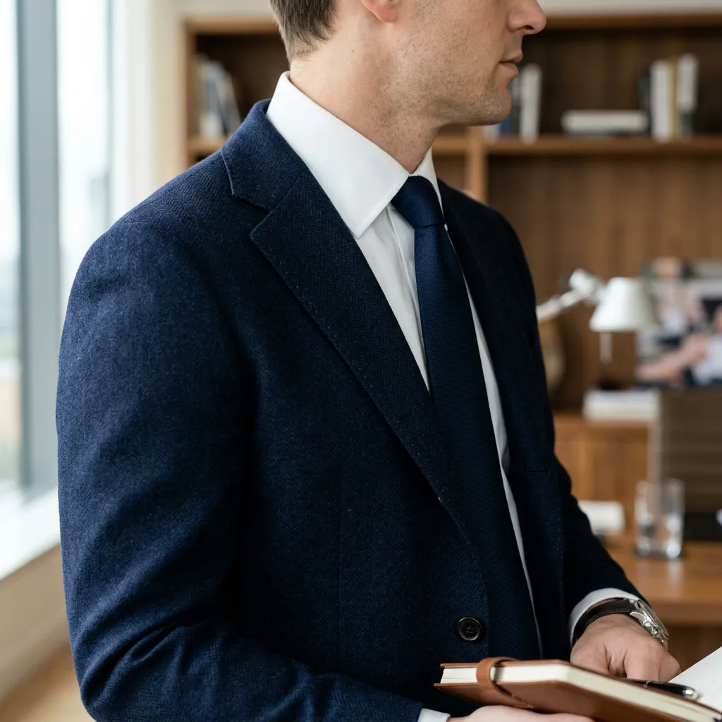
- Monochromatic Depth: To avoid a flat look, vary the textures within the same color family. Pair a navy cashmere sweater with navy wool flannel trousers. The way different fibers reflect light creates a three-dimensional depth that is the essence of luxury.
- The "Old Money" Pairings:
- Navy & Cream: A fresh, yacht-club classic that feels lighter and more intentional than navy and white.
- Charcoal & Burgundy: The ultimate "Power Couple" for winter tailoring.
- Olive & Tan: A sophisticated weekend look that bridges the gap between field and city.
 Stealth Wealth: The art of looking expensive without shouting.
III. Biological Harmony: Matching Skin Undertones
The goal of color theory is to ensure the garment highlights your face rather than washing it out. Determining your skin's "temperature" is the first step in building a wardrobe that works for you.
- Cool Undertones: If your veins appear blue or purple, lean into "cool" jewel tones. Think crisp whites, emerald green, and cobalt blue. High-contrast pairings—like a stark white shirt under a charcoal suit—are your greatest asset.
- Warm Undertones: If your veins appear greenish, earthier palettes shine here. Mustard, terracotta, burnt orange, and rich browns harmonize with your natural warmth. Avoid stark, clinical whites; opt for cream or off-white instead.
- Neutral Undertones: You are the outlier. You can oscillate between both palettes, though "dusty" versions of colors (e.g., sage green or muted lavender) often look exceptionally refined on neutral skin.
IV. The Alchemical Factor: Dye Quality and Fiber Interaction
In true luxury, color is not just a pigment; it is an interaction between chemistry and nature.
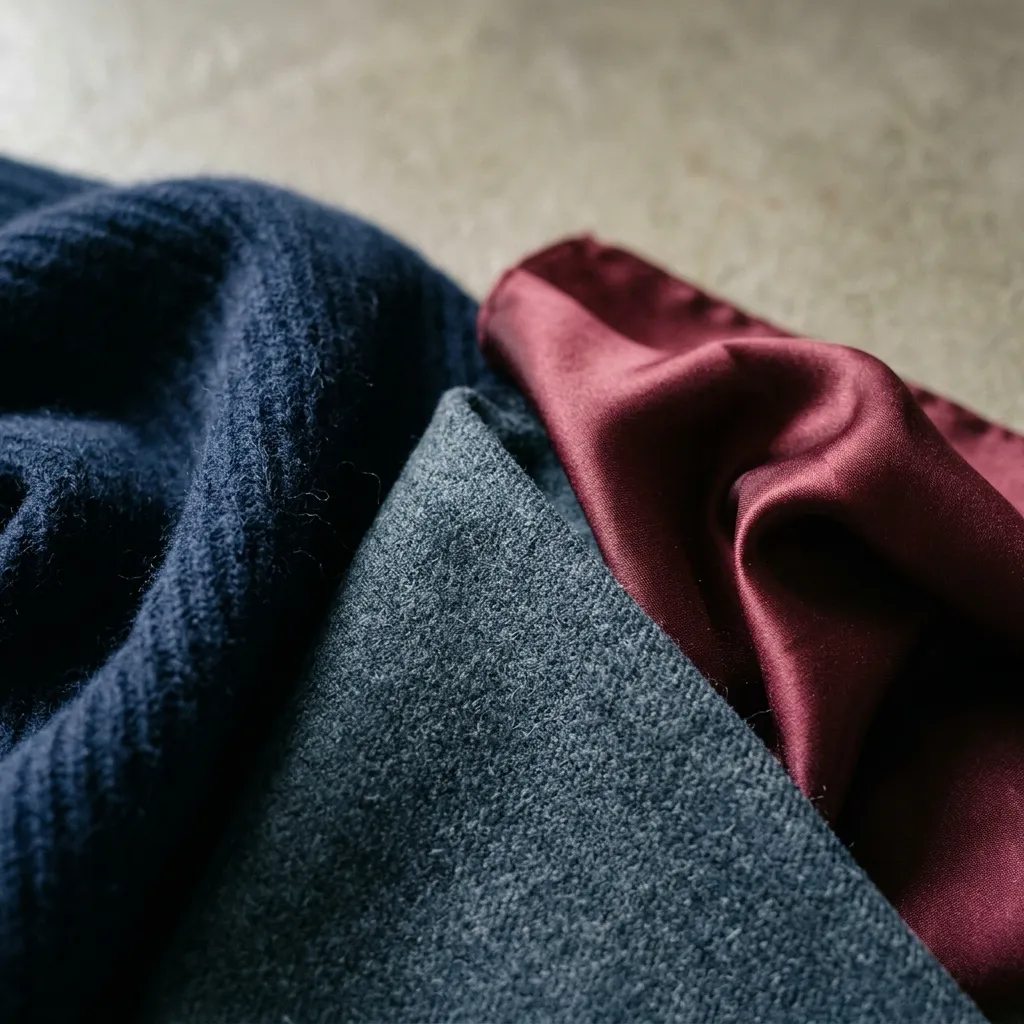
- Texture as Color: A silk tie and a wool tie in the same shade of "Navy" are not the same. Texture changes how light is absorbed. Silk has a "luster" that amplifies color, while wool absorbs it, creating a more matte, understated appearance.
- The Depth of Natural Dyes: High-end mills often use superior dyeing processes that allow for "mélange" effects—where multiple shades are spun into a single yarn. This gives the fabric a richness that flat, synthetic dyes can never replicate.
- The Rule of Lighting: Always check your ensemble in natural light. Luxury fabrics like mohair or silk-blends have a dynamic quality that can look significantly different under office LEDs versus the golden hour of an evening event.
 Texture as Color: The interplay of light and fiber.
Closing Thoughts: The Silent Advantage
Mastering color is the final frontier of the well-dressed man. It is a skill that, once honed, allows you to navigate any social or professional environment with a silent, psychological advantage. Remember: the goal isn't to be noticed for your clothes, but to be remembered for the presence they helped you project.